Tutorials → How to Build Apps
Snag List App: Next Steps
Let's look at our next requirement:
App Design: Construction Snag List
Our app currently works well on a smartphone, but if we'll be deploying it on tablets, we can make better use of the screen real estate.
Tablet Apps in JourneyApps
Any JourneyApps application can be used on either a smartphone or a tablet, and it will automatically adapt itself to fit the particular device. In addition, different sizes and screen resolutions across smartphones and tablets are also supported by JourneyApps.
JourneyApps does however offer some special functionality aimed at making better use of the available real estate on tablets. When you implement these tablet features and link your app to a smartphone, the app will still work on the smartphone and the UI features will "gracefully degrade" to match the smaller screen, as you'll see later in the tutorial.
JourneyApps offers 3 features specifically aimed at tablets:
- Columns: You can divide your View Components into two columns, allowing you to fit in more components on large tablets (e.g. 10-inch).
- Sidebars: You can add a sidebar to your View Components, that can be used to show the user what their progress is with completing a particular process in your app.
- "Proceed" Button: You can align one button per view to the top right-hand corner of the screen, next to the View Title. When a user is holding a tablet in their right hand, this makes it very convenient to tap the button to proceed to a next step in a process in your app. Therefore, this is referred to as a "Proceed" Button.
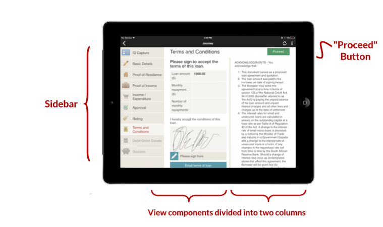
The example app in the screenshot above involves a person being signed up for a loan. We use the sidebar to show all the steps in the sign-up process that need to be completed, and the "Proceed" button is used at the top right of each screen to allow the user to move through the process easily. Columns are used to better organize information, for example on the above screen we're showing Terms & Conditions on the right while allowing the user to sign to accept the terms on the left.
Link Tablet as a Test Device
We'll now be making some changes to our Snag List app to optimize it for a tablet. The first step is to link a tablet as a test device of the Snag List app. If you don't have a tablet, you could perhaps skim through this section of the tutorial, or still make the changes even though they won't reflect when testing with a smartphone.
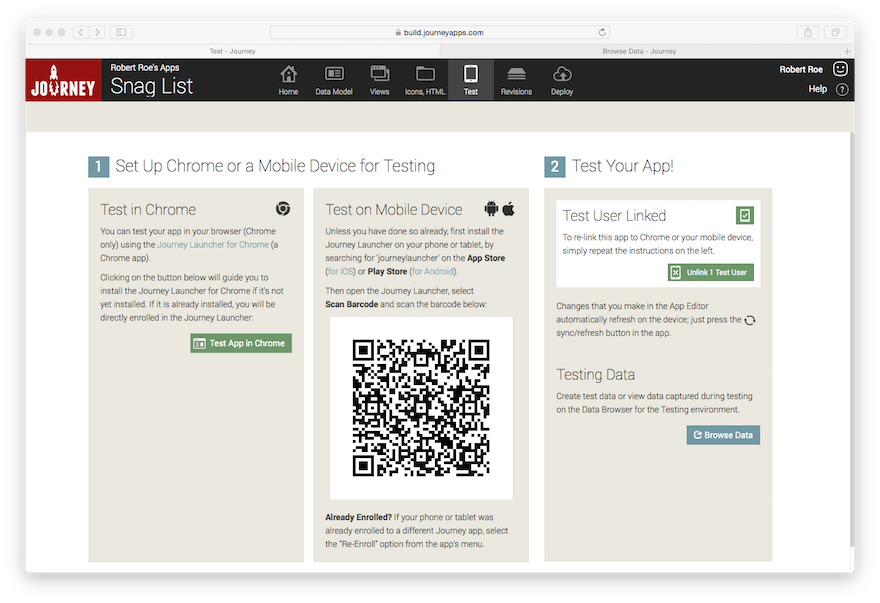
If you go to the Test tab of the Snag List app, it shows that a test device is already linked to the app. You can take your tablet and scan the barcode shown under Scan Barcode to Re-Link Your App. Note that this will cause your previous test device to be unlinked from your Snag List app (JourneyApps only allows one active test device per App Editor user at a given time).
Add Some Columns
Now let's head back to the View XML for our Main View. Under "Components go here" type columns and auto-complete, which should give you this:
Now let's cut and paste our existing components into the columns, and also add another heading and info text:
In this case, we've moved all our components into the columns. However, note that it is also possible have some components outside the columns (above or below the <columns> tag), in which case those components will span the full width of the screen as usual.
Test on Mobile Device
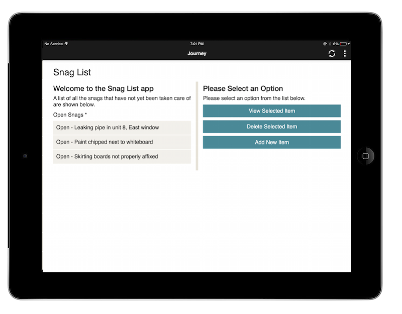
 Refresh and test the app on the tablet. It should look like the below if you are using a 10-inch tablet (if you are using a smaller tablet, the columns might be stacked as you'll see later in the Form Factors section of the tutorial).
Changes to "View Item" Screen
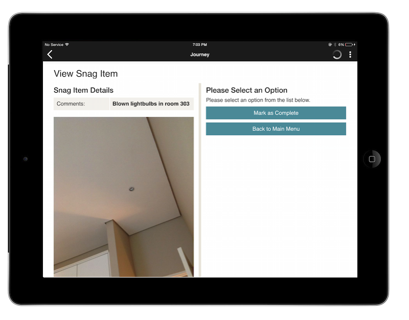
Let's make similar changes to our "View Item" screen, organizing the components into columns
This will result in the following on the tablet:
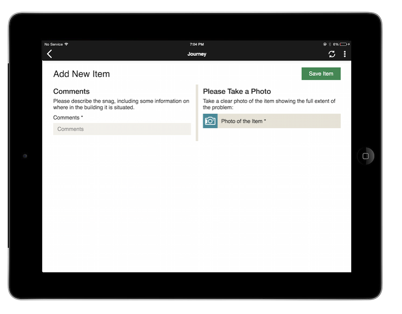
"Proceed" Button for "Add New Item"
Let's refactor the components in our "Add New Item" view with columns too, and also change our "Save Item" button to a "Proceed" Button. Note that to create a "Proceed" Button, we place the button outside of the <columns /> and add id="proceed" to it:
This should look like the following on the tablet:
Sidebars
We'll also be adding a sidebar to our app, but since sidebars are most often used in conjunction with icons, we'll wait until the next section which shows how to use icons before adding the sidebar.