Tutorials → How to Build Apps
Menu Component
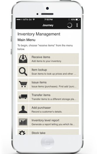
Menus can be used both on smartphones and tablets with JourneyApps. A great example of a menu used for a smartphone app's Main View is shown below — featured in an Inventory Management app:
Change Some Buttons into a Menu
A menu can be created simply by wrapping a couple of buttons in a <menu /> component. In our View XML for our Main View, let's do that to the buttons in the right column:
Menu buttons can also take a subtext="" property which can be used to show additional information on the menu item:
Test on Mobile Device
 Refresh your app on the mobile device and you should see a menu like the following. The
 subtext for each menu button is shown in smaller, light grey text below each menu button label.
Uploading Icons
As you've seen in the Inventory Management app screenshot, it is also possible to add icons to your menu buttons. Let's say we want to use the following icons for "View Selected Item", "Delete Selected Item" and "Add New Item" respectively (you can right-click on these icons and save them if you want to upload them to your own app):
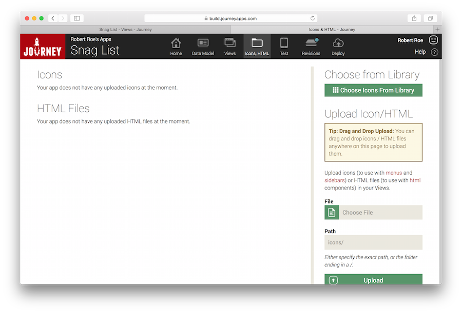
Go to the Icons & HTML tab of your Snag List app on the App Editor:
On this page, upload each of those icon PNG files. You will then be able to reference them in your View XML using the icon="" property on your menu buttons:
Test on Mobile Device
Refresh your app on the mobile device and you should see a menu with icons like below.
Add a Sidebar with Icons
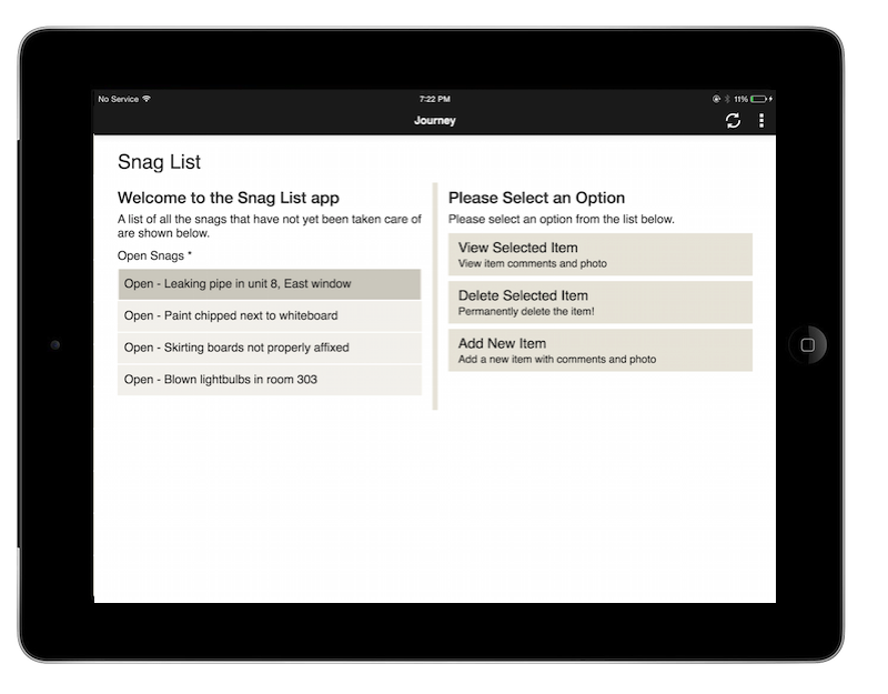
Now that we know how icons work, let's also add a sidebar to some of the views in our app. Note: Unlike menus, sidebars only work on tablets. If your app has a sidebar and you use it on a smartphone, the sidebar won't be shown.
Our app doesn't have long linear processes like the loan sign-up screenshot that you saw in the Tablet Apps section of the tutorial, so adding a sidebar to the Snag List app won't be a very good example, but it will give you an idea of how sidebars work. The closest we have to a linear process in our app is the two-step process of viewing a snag and then marking it as "Complete". We'll be using the below two icons for this purpose (the sidebar dimensions for sidebar icons is 48x48 pixels). You can save & upload them on the Icons & HTML page again, should you wish:
In the XML for your view_item view, above the <columns> tag, type sidebar and auto-complete. This will give you:
Now fill in the icons and labels:
You'll notice that sidebar items have a state="" where the first item defaults to active and the second to disabled.
Sidebar items can have one of three possible states:
- active: The sidebar item is highlighted
- normal: The sidebar item is shown normally
- disabled: The sidebar item is greyed out
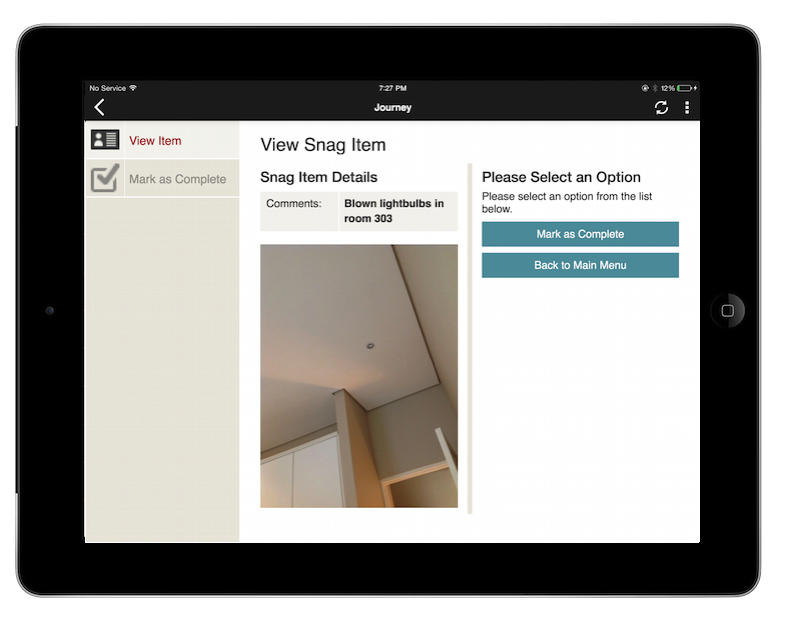
Copy Sidebar to "Marked as Complete" View
Next, copy the sidebar XML from that view and go to the Marked as Complete view. Then paste the sidebar XML under "Components go here". Finally, change the state of the first sidebar item to normal (since the user has passed that part of the process) and the second one to active.
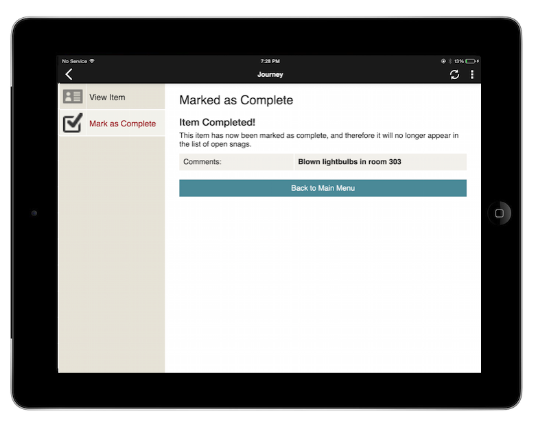
Test on Mobile Device
Refresh your app on the mobile device and you should see a sidebar with its first item indicated as "active", and then on the "Marked as Completed" screen, its 2nd item is active: