All View Components → table
Select a view component to see details on how it works:
"info" table
A component that displays a table with two columns, that can be used to display various attributes of a single object.
Not to be confused with object-tables, which is used to display a collection of multiple objects, with any number of columns and a header row.
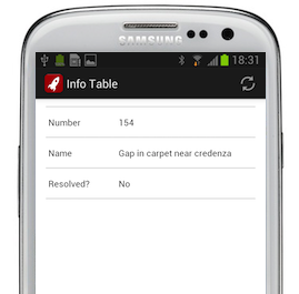
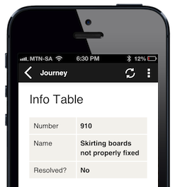
Example
The rows of an "info" table are specified using info component tags.
Code in View XML:
Appearance on a mobile device:
|
|
|
|
Configuration:
| Option | Required? | Details |
|---|---|---|
headingLabel
|
optional | Format String — Heading for the first column. |
headingValue
|
optional | Format String — Heading for the second column. |
show-if
|
optional |
Controls whether the component is hidden or shown. The argument specified to show-if can either be a literal boolean value (true or false), or it can specify a variable, parameter or attribute that can be a string, number, object, etc. that evaluates to false or evaluates to true (see the section Show/Hide Components Dynamically for full details).
|
hide-if
|
optional |
The opposite of show-if (see above).
|
Nested Tags — Info
Please refer to the info component for details about the configuration of the rows in the table.