All View Components → button
Select a view component to see details on how it works:
button
Two variations of buttons are available in JourneyApps:
- Regular buttons
- Menu buttons — which is a
buttonplaced inside a menu component.
Buttons can be used to trigger one of two things:
- Calling a JavaScript function — by specifying the
onpress=""option. - Linking to another view — by specifying the
link=""option.
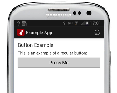
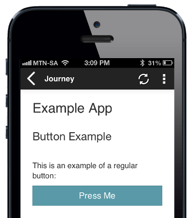
Example — Regular Button
Code in View XML:
Appearance on mobile device:
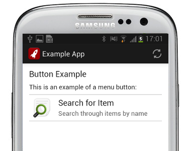
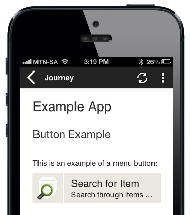
Example — Menu Button
Code in View XML:
Appearance on mobile device:
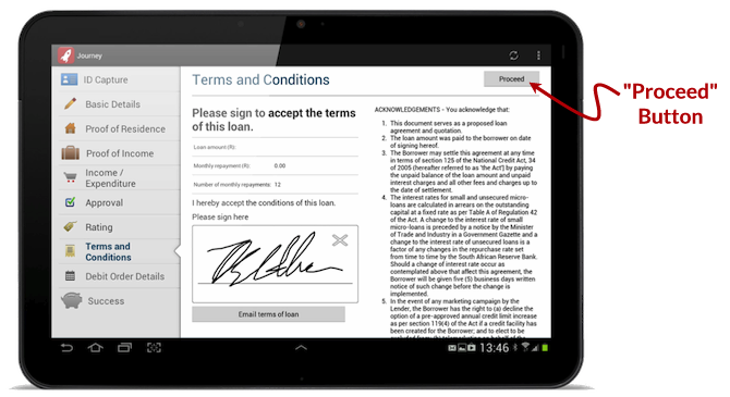
Example — "Proceed" Button (Special Case)
A special case of the Regular Button is also available that allows you to align a single button to the top right corner of the screen on tablets. This alignment of the button improves the user experience since users can easily press the button with their thumb to proceed to the next screen (hence why we call this special case a "Proceed" button).
A button can be made into a "Proceed" button by adding id="proceed" to its tag:
Appearance on mobile device:
When an app that makes use of a "Proceed" button is used on a smartphone, the "Proceed" buttons will align to the bottom of the screen instead.
Configuration
| Option | Required? | Details |
|---|---|---|
label
|
required | Text to display on the button. It can be a Format String to make the text dynamic. |
onpress
|
optional |
JavaScript function to call when the button is pressed.
A button should specify either onpress="" or link=""
|
link
|
optional |
Name of the link to open when the button is pressed. See Links for details.
A button should specify either onpress="" or link=""
|
validate
|
optional |
Set to true to run validations when this button is pressed (in other words, check whether any required input fields are not empty), before running the action or opening the link. Set to false to disable validations when this button is pressed. Defaults to true.
|
id
|
optional |
Setting id="proceed" will cause the button to be displayed in the top right corner on tablets.
|
show-if
|
optional |
Controls whether the component is hidden or shown. The argument specified to show-if can either be a literal boolean value (true or false), or it can specify a variable, parameter or attribute that can be a string, number, object, etc. that evaluates to false or evaluates to true (see the section Show/Hide Components Dynamically for full details).
|
hide-if
|
optional |
The opposite of show-if (see above).
|
Configuration — Specific to Menu Buttons
The following apply only to menu buttons (i.e. button inside a menu component).
| Option | Required? | Details |
|---|---|---|
icon
|
optional |
Path of the icon to display on the button, left of the text. Icons can be uploaded using the Icons & HTML tab of the JourneyApps Editor. |
subtext
|
optional | Text to display below the normal button text, in a smaller font. It can be a Format String to make the text dynamic. |
See Also
menu can be used to render buttons in a menu.