All View Components → sidebar
Select a view component to see details on how it works:
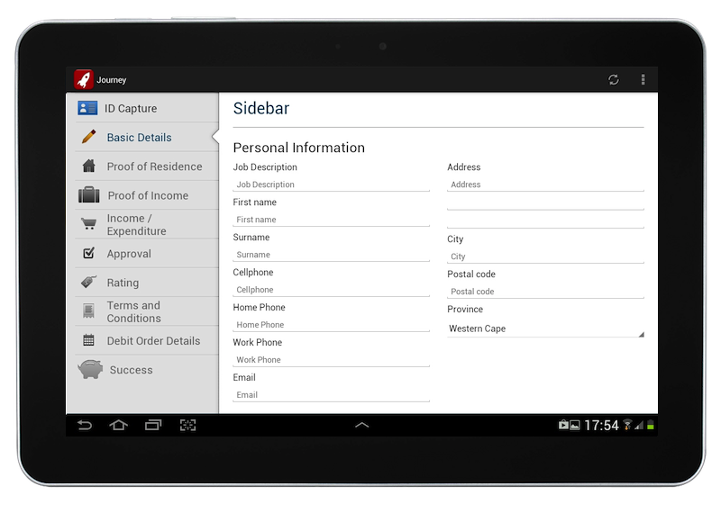
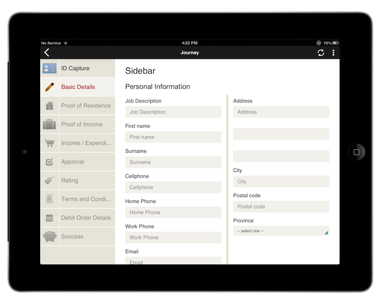
sidebar
A component that allows a sidebar to be displayed on the left side of the screen on tablets, to indicate to the user how far they are progressing with a process.
The sidebar is not shown if the app is used on devices with smaller screens.
The sidebar must be the first component in the View XML.
Example
The text contained inside the <sidebar> tag can be a Format String, meaning that you can make the text dynamic.
Code in View XML:
Appearance on mobile device:
Configuration — For Each Item:
| Option | Required? | Details |
|---|---|---|
state
|
optional |
The way the sidebar item is visually rendered, to indicate to the user whether they have already completed the step indicated by the sidebar item in a process. It can be one of the following:
active. All fields before it should be normal, and all fields afterwards should be disabled.
Defaults to normal.
The value provided can be a Format String if you need to dynamically toggle a sidebar item's state based on a variable's value. |
icon
|
optional |
Path of the icon to display on the sidebar item, left of the text. Icons can be uploaded using the Icons & HTML tab of the JourneyApps Editor. |
show-if
|
optional |
Controls whether the sidebar item is hidden or shown. The argument specified to show-if can either be a literal boolean value (true or false), or it can specify a variable, parameter or attribute that can be a string, number, object, etc. that evaluates to false or evaluates to true (see the section Show/Hide Components Dynamically for full details).
|
hide-if
|
optional |
The opposite of show-if (see above).
|