All View Components → checklist
Select a view component to see details on how it works:
checklist
An input component that allows the user to select multiple options from a list (if you are looking for an input component allowing the user to select a single option, look at selectbox).
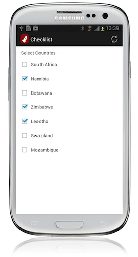
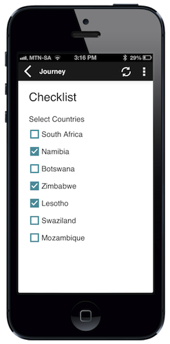
Example
Code in View XML:
Appearance on mobile device:
|
|
|
|
Configuration:
| Option | Required? | Details |
|---|---|---|
bind
|
required |
Variable/attribute in which to store the input value of the field. Must be a variable or attribute of type enum_set(see Attribute & Variable Types for more details) |
label
|
optional | Text to display above the checklist. It can be a Format String to make the text dynamic. |
required
|
optional |
true if the checklist must have at least one option selected when proceeding to another view. Defaults to false.
|
on‑change
|
optional | Function to call after a value is checked or unchecked. |
options
|
optional |
Instead of displaying all of the possible values of the enum_set as defined in the Data Model or variable, only display certain options. Specify the indexes (starting at zero) of each desired option from the bind enum_set as a comma-separated list. For example: options="0,2,5" will only cause the 1st, 3rd and 6th option of the enum_set to be displayed in the checklist.
|
show-if
|
optional |
Controls whether the component is hidden or shown. The argument specified to show-if can either be a literal boolean value (true or false), or it can specify a variable, parameter or attribute that can be a string, number, object, etc. that evaluates to false or evaluates to true (see the section Show/Hide Components Dynamically for full details). If the component also specifies required="true", but it is hidden, the validation will be ignored/skipped.
|
hide-if
|
optional |
The opposite of show-if (see above).
|