All View Components → list
Select a view component to see details on how it works:
list
A component that displays a list of objects, and optionally allows the user to select an object.
There are two main types of lists in JourneyApps:
| 1. Regular Lists | 2. Dropdown Lists |
|---|---|
| This list simply displays all items underneath each other. | This list displays items in a drop-down. |
|
|
Regular Lists can further be customised in three different ways:
| A. Regular List: Non-Selectable | B. Regular List: Selectable | C. Regular List: Clickable |
|---|---|---|
| This list can be used for display purposes only and doesn't allow the user to select anything. |
This list allows the user to select one of the objects in it, which is then highlighted. The selected object is stored in a specified variable (specified using bind="" — see Configuration below).
|
This list allows the user to tap / "click" on a particular object, and a specified JavaScript function is then immediately called, and the object that the user selected is passed as an argument to the JavaScript function. |
|
|
|
|
| A Selectable List is typically used in conjunction with a button — The user selects an object in the list, and then clicks a button to take an action — for example call a JavaScript function which does something with the object that the user selected (referencing the variable in which the selected object is stored), or follow a link (passing the selected object as a parameter to the next view) |
A little arrow on the right side of the list items hints to the user that the list items are clickable. The JavaScript function that is called when the user taps on a list item is typically used to follow a link to a next screen — Therefore, a Clickable Regular List is used for similar cases as a Selectable Regular List, but it provides a better user experience because it requires less scrolling and tapping by the user. |
Applicable to All Examples: Initialisation of Data in JavaScript
All lists use a Query to determine what objects are displayed in it. The query is stored in an array variable.
Code in View XML:
Code in View JavaScript:
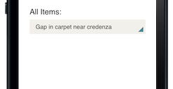
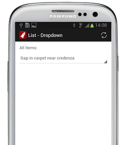
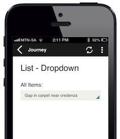
Example 1 — Dropdown List
Since a dropdown list allows a user to select an option, you need a variable in which to store the selected object, and then specify that variable at bind="" in the list.
Code in View XML:
Appearance on mobile device:
|
|
|
|
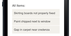
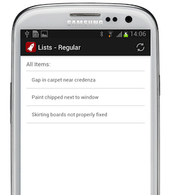
Example 2 — Regular List: Non-Selectable
Code in View XML:
Appearance on mobile device:
|
|
|
|
|
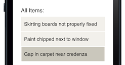
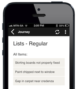
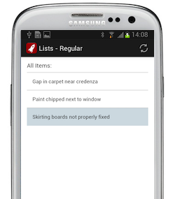
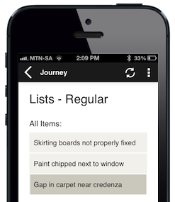
Example 3 — Regular List: Selectable
Code in View XML:
Appearance on mobile device — when the last item has been selected:
|
|
|
|
|
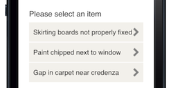
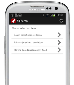
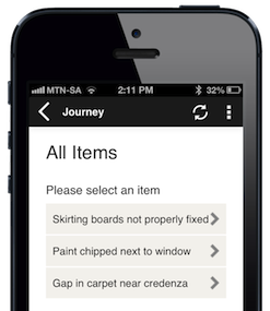
Example 4 — Regular List: Clickable
Code in View XML:
Note that a function name of your choosing is specified at onpress="", which you then need to define in the view's JavaScript. The object that the user selected in the list is passed as an argument to this JavaScript function (clickedItem in the example below).
The most common use case of a clickable list is to call a link when the user clicks on an item, and pass the clicked object as an argument to the link — which we show in this example below.
Code in View JavaScript:
Appearance on mobile device:
|
|
|
|
|
Configuration:
| Option | Required? | Details |
|---|---|---|
collection
|
required |
Name of the array variable storing the query to populate the objects shown in the list.
Note that the sorting of the query will determine the sort order of the items in the list. See Sorting for more information. |
type
|
optional |
Type of list — either:
dropdown
|
bind
|
optional |
The name of the variable in which the object that the user has selected must be stored. It must be an object of the same type as in collection.If bind is not specified, this list will be Non-Selectable.
|
label
|
optional | Text to display above the list. It can be a Format String to make the text dynamic. |
emptyMessage
|
optional |
Text to display when the collection is empty. Defaults to "No data".Only applicable to Regular Lists ( type="static").
|
required
|
optional |
If this is a Dropdown List or a Selectable Regular List, setting required="true" will require the user to select an object before proceeding to a next view.Defaults to false.
|
show-if
|
optional |
Controls whether the component is hidden or shown. The argument specified to show-if can either be a literal boolean value (true or false), or it can specify a variable, parameter or attribute that can be a string, number, object, etc. that evaluates to false or evaluates to true (see the section Show/Hide Components Dynamically for full details). If the component also specifies required="true", but it is hidden, the validation will be ignored/skipped.
|
hide-if
|
optional |
The opposite of show-if (see above).
|
Nested Tags — For Clickable Lists
To make a Regular List a Clickable List, an <action> tag should be added inside the <list> tag (as can be seen in the example above)
The <action> tag has the following configuration:
| Option | Required? | Details |
|---|---|---|
onpress
|
required | The name of the JavaScript function that should be called when the user clicks on an object in the list. |