All View Components → info
Select a view component to see details on how it works:
info
A component that simply displays text.
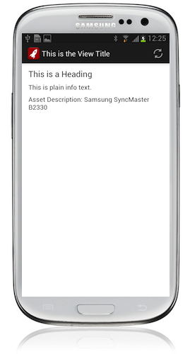
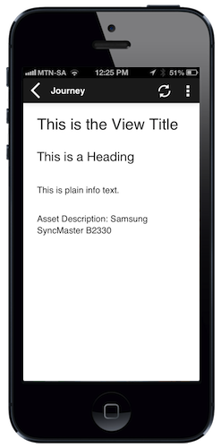
Example 1
The simplest way to use an info component is simply to specify the text you want to display between the <info> tags — and you can also include Format Strings (e.g. {asset.description} in the example below) to include dynamic text:
Code in View XML:
Appearance on mobile device:
|
|
|
|
Example 2
It's also possible to use value="" to specify the text to display, and optionally label="" to display a label to the left of the text. Lastly, you can specify bind="" to display a single variable or attribute in the info component:
Code in View XML:
Configuration:
| Option | Required? | Details |
|---|---|---|
label
|
optional |
Label text to display to the left of the info component's text. It can be a Format String to make the text dynamic. |
value
|
optional |
Text to display in the component. This is an alternative to specifying the text inside the <info> tags.
|
bind
|
optional | The name of a single variable or attribute of which the value should be displayed in this component. |
show-if
|
optional |
Controls whether the component is hidden or shown. The argument specified to show-if can either be a literal boolean value (true or false), or it can specify a variable, parameter or attribute that can be a string, number, object, etc. that evaluates to false or evaluates to true (see the section Show/Hide Components Dynamically for full details).
|
hide-if
|
optional |
The opposite of show-if (see above).
|
See Also
table can be used to render info fields in a table style.