All View Components → datetime
Select a view component to see details on how it works:
datetime
An input component that allows the user to enter a date & time.
Example
Code in View XML:
Appearance on a mobile device:

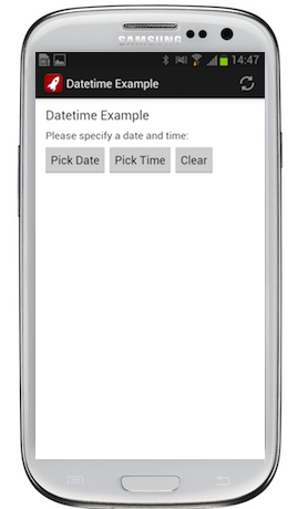
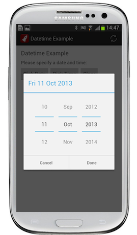
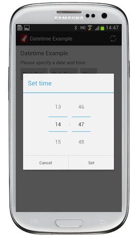

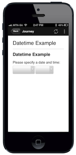
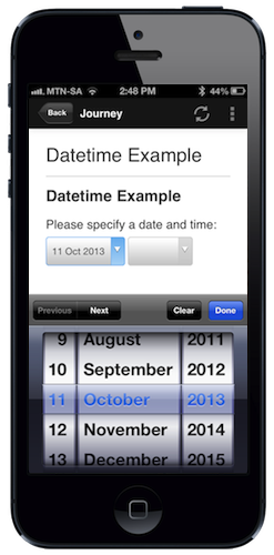
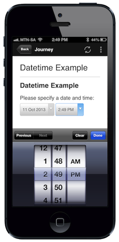
Configuration:
| Option | Required? | Details |
|---|---|---|
bind
|
required |
Variable/attribute in which to store the input value of the field. Must be a variable or attribute of type datetime(see Attribute & Variable Types for more details) |
label
|
optional | Text to display above the date input. It can be a Format String to make the text dynamic. |
required
|
optional |
true if this field must have a value when proceeding to another view. Defaults to false.
|
on-change
|
optional | Function to call after the selected date or time is changed or cleared. |
show-if
|
optional |
Controls whether the component is hidden or shown. The argument specified to show-if can either be a literal boolean value (true or false), or it can specify a variable, parameter or attribute that can be a string, number, object, etc. that evaluates to false or evaluates to true (see the section Show/Hide Components Dynamically for full details). If the component also specifies required="true", but it is hidden, the validation will be ignored/skipped.
|
hide-if
|
optional |
The opposite of show-if (see above).
|
